Part 1
Part 2
Thursday 15 December 2011
analysis of a music video
Coldplay - Paradise
genre: Alternative/Pop
- completely unconventional music video
- band members appear as the elephants but we only find this out right near end of video
- bright lighting and colours are used
- lryrics match up with visuals such as the lyrics throughout the song are displayed on cardboard plaques
- when talking about paradise shows the elephant in nice forest locations
- the video altogether though does not really link with the song.
- no running motifs
Basic camera angles/shot
There are many different camera angles and shots used in films/videos, these include; Extreme Long Shots, Long Shots, Medium Shots, Close-Ups, Extreme Close-Ups.

Different height orientated camera angles include; Bird’s Eye View, High Angle, Eye Level, Low Angle, Oblique/Canted Angle.
 - Birds eye view shots are often extreme long shots and are used to establish a location.
- High angle shots have multiple uses, they can be used as establishing shots, they are also used to make the focus appear smaller and sometimes less significant.
- Eye level shots are used to show the artist face to face to create a greater connection between them and the audience.
- low angle shots are often used to make people appear larger and more important.

- Extreme long shots are mainly used to show/establish locations or settings as seen in the example above.
- Long shots are usually used to show the scene in full so that the audience can get a feel for the location
- Mid shots are usually used to show the artist (person being filmed) so that the focus is on them and what they are doing
- Close ups are usually used to show emotion on the artists face only so that the audience is focus on their facial expression
- Extreme close ups are essentially used to do the same as above
Different height orientated camera angles include; Bird’s Eye View, High Angle, Eye Level, Low Angle, Oblique/Canted Angle.

- High angle shots have multiple uses, they can be used as establishing shots, they are also used to make the focus appear smaller and sometimes less significant.
- Eye level shots are used to show the artist face to face to create a greater connection between them and the audience.
- low angle shots are often used to make people appear larger and more important.
analysis of a music video
The Only Exception - Paramore
genre: Punk rock
- follows a story-line so matches the lyrics
- punk everyday outfit
- notion of looking into someone's house
- laying on the pile of heart matches song lyrics
- wide shot of the whole song
- lots of close ups of main artist
- close ups of the band playing
- effective use of costume changes
- some outfits are more seductive than others such as the dress on the date
- ends on the same scene that the song begins on
Wednesday 14 December 2011
Contacting The Saturdays

I found out that fascination records were The Saturdays management team and so decided to email them concerning using their song as our choice. Above is what i would of wrote.
Themes in The Saturdays music videos
The Saturdays is a girl group and is made up by 5 different singers. In every one of their music videos they have made it colourful through the clothing they wear or the accessories that they use. A good example of this is their music video to their song 'Up'.

The above screen shot is from one of the first fast shots 1) setting the pace of the video which fits in with the genre and 2) giving a clear imagery of colour which associates with The Saturdays and is consistant through all of their videos.
The screen shot below is also from one of the first shots in the video which shows the different colours and allows the audience to associate the different colours with the different members of the group.


As I pointed out earlier they also use the accessories to associate their colours with themselves as this screen shot is showing, the member that the shot is focused on is holding an orange bad and an orange ring and as seen in other shots from the video, is also wearing orange tights and holds an orange microphone in the video just as the member in the back ground of this shot is holding a pink/purple microphone and also wearing the same colour tights.
Evaluation indiviual timed response - Melissa
In our music video we changed normal video conventions where the artist is made to look glamourous whereas we made our artist, Emma, look ordinary and having a really bad day as we wanted to show that all though singers/artists are famous, they also have bad days. Our digipak is a cross between a happy mood and a bad mood. Our magazine advert has a screen shot of Emma from the video throwing her broken umbrella to the floor in frustration. This challenges the conventions ussually used in a magazine advert as the producers of the advert may use; a photo of the CD album or they may have done a photo shoot of the artist looking glamourous using a theme from the music video or something that apears in several of the music videos of the album and the photo of the artist would most likely be a close up of the artist's face. Some of the writing on the magazine advert is slightly harder to read and in my opinion, now that I've looked back at it, should be a different colour than orange and blue, that is easier to read on the background colour that it is on and i feel a dark red would have been a better colour to use as it would have shown up on the background.
For the DVD cover we used the same font for "The Saturdays" as in the magazine advert, but we used a darker shade of orange. We have Emma looking slightly more glamourous as it isn't just for the song "Had it with today", but for all the songs that are featured in the album. What we did use to show that the product was connected with the video and to connect it with the magazine advert was the umbrella idea.
When viewed seperately, the audience would be able to link all three products together from the simple but effective image of Emma with the umbrella. This is because in the video the shot of Emma with the umbrella is quick but the fact that the umbrella is in the album cover and she looks happy and it's a different one triggers the idea that she has a new umbrella and that simple things in life can make people happy.
The feed back we recieved was helpful to us as it told us what we did good and the auidence made it clear what they didn't like about the video and through that suggested what we could have done to make it better. The audience liked that the visuals in the video we made matched the lyrics which was used quite a few times in our video. The outfits Emma wore during filming had quite dark colours and she mainly wore black trousers or jeans which we and the audience felt helped reflect a bad/dark mood which is the subject of the song which is what we wanted to get across to the auidence. Another technique we used which was mentioned in the audience feed back, was that we used the idea of voyersim, the notion of looking, which was shown twice in the first part of our video. The first time was when Emma was in bed waking up and the second was through the mobile phone and the text that was recieved.
To create our music video and digipak we used several different technologies which ranged from the construction, research, planning and the evaluation stages. For our research we used a number of websites that contained the theories we need, for example, Goodwin's theory. We also used google to gain images of real magazine adverts and album covers which we then analysed to for research on what we would need to include in ours. We also looked at several music videos which had the same genre as ours and also at several music videos which The Saturdays had already created in the past. For our planning we used still cameras to blog our written ideas which includes our story board, time line for our deadlines and feedback which we later decided to type up instead. We also took still shots with the HD film camera, which we also used for filming, for the ideas of our possible locations and to do test shots for our video to see where and how we'd position the camera. For the construction of our video we used the following technologies; HD film camera, Mac computer and final cut. We tried several techniques available from final cut on our film shots to get the best we possibly could get out of our video. We also had advice from the technician who advised us to make our shot durations shorter and add more shots to make the video correspond to the genre of the song. For our magazine advert we used final cut and photoshop to get the image we wanted and the text. I feel we didn't spend as much time needed on the magazine advert as was needed as I feel it could have been done better if we'd spent a bit more time on it.
We used a HD film camera and took still photos, tripod, iphoto and photoshop for the album cover. I think this product is our best as we put a lot of time and effort into producing this product and aligning all the peices of the photo together, getting the shadows right and also adding all the text. The colour of the text has my mixed opinion. The red writing shows up well and is easy to read as is the dark orange for "The Saturdays"
Lighting Research
Ambient Lighting: light already present in a scene before any extra lighting is added.
Incident Lighting: Light sourced from a light source such as a lamp.
Reflected Lighting: Light seen after bouncing off a surface.
Contrast Ratio: difference in brightness between the brightest white and darkest black.
Hard Light: Light directly from a source such as the sun tavelling undisturbed onto the subject.
Soft Light; Light that appears to wrap around the subject produces less shadows or softer shadows.
Key Light: main light on subject in 3 point lighting provides most of the illumination and contrast.
Fill Light: light placed to the side of the subject to fill out shadows and balance the key light.
Back Light: Light placed at rear of subject to create light from behind.
 Hard Key Lighting
 Low Key Lighting
 Contrast Ratio
anaylsis of a music video
Missing you by The Saturdays
genre: pop girlband
genre characteristics
- lots of different camera angles of the band
- close ups of individual members to start and finish the song
- use very girl based locations such as the beach and a flowery meadow and a club like resort
- use of a short dance routine - sexy dance moves used
- the lyrics do reflect the mood of the song but there is no real connection between the two things
- picks up the pace of end of song and video cuts to a scene of a club where everyone is dancing.
- this is used as the girls are dressed in low cut bikinis and tops and small shorts. the floatly outfits though such as the sarongs on the beach do help to reflect the mood of the song.
Anaylsis of a music video
Panic! at the Disco - Ballard of Mona Lisa
genre: Alternative rock
genre characteristics
- camera: lots of close ups used of the lead singer and the instruments and loads of long shots used to show whole band.
- Editing: there are always cuts between the performance and narrative such as everytime the drummers beat comes in it cuts to an image of him.
- Mise - en - scene: unique costumes for the band which are old fashioned and mainly in very neutral colours creams, blacks, browns and white.
- dark low key lighting is used.
- when stating rules such as rule 1 open all windows we see a girl cross to the window and open it.
- when the chrous comes in there are a lot of close ups of the lead singer and a lot of fast paced editing such as jump cuts.
- motif: always use very old fashioned style locations and videos.
- motif: use same scenery from older video before it changes
- close ups of artist and band
- no voyeuristic views of women
- notion of looking when the door opens and we get the view that the audience are looking through the door to all the people talking inside.
Tuesday 13 December 2011
mood board for our music video

Friday 2 December 2011


directors commentary planning lesson 1
For the first piece of our planning for our directors commentary we all had to do a timed response to the evaluation questions. This was a good idea as it helped us plan what we needed to focus on in our products and which bits in the video we felt were strongest in our opinion. This was good as we were not being influenced by each other. This time was good for me as it gave me the chance to really think about the improvements and strengths that we had throughout this project and how to format it in the directors commentary. After putting together all the ideas from our individual timed response we are then going to put them into a script format so we can use the ideas as our commentary.
Evaluation questions
1 - In what ways does your media product use, develop or challenge forms + conventions of real media products?
In our media product there are many ways in which we have both conformed to and challenged conventions of real media products. For example, we have challenged the conventions of the main artist looking glamourous as is done by the saturdays. We have done this by making our artist, emma, look like an average everyday person so that the audience can relate more to the artist.
Our video in many ways follows the usual conventions of a music video in that we have a wide variety of shots including many close ups and long shots of the artist. We also have many shots of the main artist dancing which is common of music videos.
Our digipak follows the conventions of a digipak quite well in that we have an image of the artist on the cover along with the artists name and album name in big bold lettering. on the rear of the cover we have the track listings as well as a list of bonus features also. we have included a quote from a review on the cover as well which is common of digipak to increase sales.
Our magazine advert also conform to the conventions of a magazine advert well as it shows an image from the video as well as the artist and album name in bold lettering. We have also included a sale date and the name of the shop where it would be sold.
2 - How effective is the combination of your main product and ancillary texts?
In my opinion the combination of our main product and ancillary products works very well. we have a recurring theme of the use of umbrellas both in our digipak and magazine advert which links in well with one of our strongest scenes in the video of emma with an umbrella. This theme helps to link the 3 products well and effectively promotes our product.
Our magazine advert links well with the video particularly as the main image of our artist is a screen shot from our video. The combination of our main product and our ancillary texts works well as the ancillary texts both promote the video well and help to give some idea of the quality of the video before it's viewed.
However, our song and video is about a bad day and i fell that our ancillary texts, particularly the digipak, fail to get this message across as neither indicate a bad day.
3 - What have you learnt from your audience feedback?
Our audience feedback indicated that their was a good link between the lyrics and the visuals throughout the video and that the message we put across in our video was clear. We have also learnt from our feedback that our video was well edited and that our audience particularly liked our split screen effect.
The feedback also indicated that more locations would have improved the video as well as a greater variety of shots, also that as the song was quite fast paced the shot durations should have been shorter to be more in keeping with the song.
From this feedback I have learnt that if I were to make this video again I would have used more shots at a faster pace to keep up with the beat of the song. I would also have used a greater variety of editing techniques to make the video more interesting to the audience.
4 - How did you use new media technologies in the construction + research + planning + evaluation stages?
In the construction stage of our project we used HD video cameras to film the video as well as a speaker to play the song as we shot to help with lip syncing and timing. Once filmed we used the program final cut express to edit our video and piece it together. Throughout this editing process we also used the website blogger to blog our progress, we also used this website throughout the research and planning stages by blogging all the different pieces of research and plans we did.
We used the program photoshop in the construction of our digipaks and magazine advert to edit images and create these products by adding text and other images.
we used the powerpoint program to create our pitch for our promotional package in which we pitched the ideas for our products. On top of this we used the program word at various stages to type up various bits of research.
we used the website youtube to watch other music videos in the research stage to gather ideas for our own video and in the evaluation stage to analyse and evaluate other videos.
We also used the program Iphoto to upload images for our products during the construction stage as well as iTunes to listen to our song during the planning stage.
Thursday 1 December 2011
Evaluation individual timed response
In what ways does your media product use, develop, or challenge forms and conventions of real music products?
The first thing about our music video is how unconventional it is especially in the artists style and how we portrayed this. We decided as the song was about a bad day it was a better idea to put the artist across as an average everyday teenage girl rather than the normal glamourous look that pop girl bands normally use. I believe this was the biggest way we challenged the conventions of a real music video. I believe by challenging the conventions of having a glamourous artist we have developed our artist into a sutiable role model. By using an everyday image we have created a way for young girls to relate to the artist. Another way we developed the conventions of our music video was we decided it should follow a storyline which is something that is rarely done by girl bands or female pop artists. By doing this I believe we created a good strong link between the lyrics and visuals which is one of Goodwin's theory points. The outfits we used as well also showed that unlike Goodwin's theory not all videos need to put women into voyeuristic outfits to be successful so this was also an example of challenging the stereotype. I found we did use the conventions for our genre effectively in our video but instead of using them like normal we altered them so they could be challenged which I think gives our video a bit of a unique edge.
How effective is the combination of your video and ancillary products?
I believe all 3 products as a combination work well together. I believe this as we managed to get across the feeling of a bad day throughout all 3 products. We decided when designing the products that our visual theme that would run through all 3 products would be umbrellas. We decided this as a group because a lot of people say they have bad days due to rain or weather and this is the link we used and assosiated with umbrellas. Between all 3 products we used the same outfits, locations and colour scheme to create a strong connection and link between the music video, digipack and magazine advert. We also used an image from our music video where our artist throws her umbrella in frustration as our magazine advert image as we believed it got across the theme well and the feeling of defeat on a bad day.
What have you learnt from your audience feedback?
From our audience feedback I learnt we used a great deal of matching lyrics and visuals such as when the artist sings 'woke up this morning feeling bad' we actually see an image of her waking up looking miserable and finding a text from her boyfriend saying he wants to break up. The feedback also suggest a good link between the music and visuals as there are images of her being bullied which really well match the songs mood. The dark colours also add a good link to the mood of the song. They also believed by using a mobile phone in the video we gave the impression/notion of 'looking' which standard music videos have. They also said our use of planning and thinking for shots such as panning and tracking shots was used effectively and added good variation.
How did you use new media technologies in the construction, research and planning and evaluation stages?
For the construction of our video we got to use high definition (HD) cameras for the filming stage of our video these were great as it not only added detail which we couldn't see but it also gave our video an amazing quality. We also got to use photoshop and final cut this was a lot of fun as its always a new challenge to use these programmes but through using these programmes we got to add in some awesome effects to both our music video and digipack such as the spiltscreen effect used during the music video and through photoshop we created the awesome effect on the digipack where it looks like i'm standing on the field in 3 different places at once. For our media products as a group we always get assigned a new blog specific for our group on blogger. This was especially helpful during the research and planning stage as anything useful we found on the internet or any new ideas could be blogged from anywhere even home so nothing could be forgotten very easily. In our evaluation we are going to get to use the studios to film a directors commentary. Doing an evaluation as a directors commentary is new and different and interesting and should be a good way to show off more of our skills as a group with a camera and on final cut when we edit it.
Wednesday 30 November 2011
Final Video feedback
U1-47
pros
costumes work well with genre.
lyrics match visuals well such as when he counts on his fingers
shot variation fits with fast pace
lip syncing effective
change of artist in song fits with change they did with people
good use of locations
cons
ends a bit suddenly if this was deliberate sorry its not really a criticism just something a bit random don't know if it works
Final Video feedback
U1-46
pros
good use of locations
good dance routine fits in with genre
shot variation good
good use of spiltscreen
close ups used good
cons
some of the locations a bit plain
spiltscreen good but didn't fit with beat of the song
could of used a few more close ups
pros
good use of locations
good dance routine fits in with genre
shot variation good
good use of spiltscreen
close ups used good
cons
some of the locations a bit plain
spiltscreen good but didn't fit with beat of the song
could of used a few more close ups
Final Video feedback
U1-43
The skipping and the peeking out from behind the bush at the beginning give the video a fun element. The locations create a nice motif as they are used throughout. Use of movement by artist fits well with pace of song and the lip syncing is used in effective places. The way sophie disappears into the leaves at the end is sort of like leaving wonderland so gives the video an example of where the lyrics match the visuals.
Cons
very beginning the lip syncing doesn't look totally in sync. two scenes where sophie is rolling in leaves camera a bit wobbly
Final Video feedback
U1-48 final video
Likes
I love the use of the graffiti at the beginning of the song as I believe it fits in well with the songs genre.The skateboarding scene is good as it acts as a break between the singing so helps keep audiences attention. the black and white effect is really effective as it fits in time with the musics beat and the editing and camera angle variations are good.
Cons
too little lip syncing.
some of the shots were not very clear.
Directors Commentary
What is a directors commentary?
- A directors commentary is a discussion about an event or a piece of production work such as a music videos, films or documentaries.
- additional audio track
- consists of a lecture or comments by one or more speakers
- plays in real time with video
- they can be entertaining or serious
- can add information for audience members that might not otherwise be disclosed to them
- theres are many different types of commentary. they are...
- partial or scene specific - only covers specific scenes in the production. sometimes they are filmed without the speaker watching the video and this may mean the speaker uses more general comments than specific details.
- feature length or scene specific - recorded in one session. speaker watches the video from beginning to end and gives thoughts on what is happening on screen at the time.
What is a directors commentary?
There are several different types of commentary. The two main types simply define the length of the commentary rather than the type of content. They are:
- Partial or scene-specific, which only covers selected scenes of the film. Sometimes these are recorded without the speaker viewing the film and thus the commentator may make more general comments than pointing out specific details.
- Feature-length or screen-specific, which is recorded in one session: the speakers watch the movie from beginning to end and give their thoughts directly based on what is happening on-screen.
Tuesday 29 November 2011


Feedback
U1 44
Pros -
Good use of Visuals and lyrics
Good use of effects
The splitscreen is effective in the last few sections
Cons -
Bad use of locations
Shots need to be more varied
Face paced song, needs more shots
Some pieces are unclear (Matt walking into Emma, Mellisa smoking - I obviously knew but your audience won't)
luka, josh, shona
Thursday 24 November 2011
Location reccie for digipak (photo 4)

This photo shows the full potential of the leaf piles that are available and there are also a lot of trees to be used. Next lesson we will take photos from the best two locations that we have found and then edit both and submit the one that works best for our album.
Location reccie for digipak (photo 3)

This is our third possible location idea for the photo shot for our digipack. For this shot we have tried to incorporate both the woodland and the field to merge he 2 ideas and give us a wider variety of possible shots and positions that emma can be in. As well as having shots of her in different poses at different positions on the field, we can also have her in the woodland setting, hiding behind trees and such.
Location reccie for digipak (photo 2)

After looking around for another possible location we came across the woods where we filmed part of our music video. Our idea is the same except possibly using trees for Emma to climb, if she can't climb them then find a smaller tree. She could also hide behind one of the trees as it will bring an element of playfulness into the album. This photo doesn't show the full potential of the leaf pile and the different heights of the trees which we could use. We then took another photo at a different angle.
Location reccie for digipak (photo 1)

We took this photo as our first idea as the album cover and have Emma standing at different points of this photo holding different coloured umbrellas and in different poses. After looking at other locations for this idea we found that a field is quite boring as an album cover as we could use the woods and use the leaf piles and trees as props.
Drawn idea for album cover

This is our basic idea for our album cover. We will take various photos of Emma standing in different places in the field or woods and put the photos on top of each other to make it seem as if she is in a lot of places at once.
As you can see in the top right corner, we will have an image of a phone on the rear cover displaying the special features of the digipack. This idea was taken from the shot of the phone in our music video, the same phone will be used in the same way to display the connection with our video.
On the front cover we will have a promotional sticker, possibly displaying a quote about the quality of the album and illustrating why the audience should purchase the album.
We will also have a track listing on the rear cover to display which tracks are included in the digipack as well as the artist and album name on the front cover.
Tuesday 22 November 2011
An example of a real digipak
![[PROG TRIP] Digipak](http://farm3.staticflickr.com/2754/4353567916_15c58364e6.jpg)
This digipak for a CD cover has similar pictures to show the viewer that these 2 products are a set. It is shown through the animated face in the middle of both products but they are different from each other. This is to distinguish between the different types of the same products.
Digipaks ussually include:
Album CD front cover:
- Lyrics on an album
- Photos of the artist (possibly signed)
- Mention of bonus (tracks, video, karaoke, slide show)
- The Album name
- Bar code
- Album art
- Artist name
- A simple colour scheme that is consistent throughout the digipak
- Different colour for the font that will stand out
- Font that is bold and simple so it's easy for the viewer to read. Also have different or similar font for the album name and artist name
Album CD back cover:
Analysing a real magazine advert

This magazine advert promoting the album for Plan B has the conventions that it needs such as:
- The artist name
- A picture of the artist
- The album name
- Critic reviews
What it doesn't have is where the album is available from, when it's available to buy or the price.
The first thing that is noticed in this image is the "Plan B" written in red right at the top of the page, then the artist's picture as its associated with the name. The next thing is the white writing under the "Plan B" The writing slowly gets smaller down the page until the critics are the smallest and harder to read except for the 5 stars.
The artist in the image is in the right side looking towards the left with a microphone that is associated with the old style of music. This works well as the music that Plan B makes is in the style of old music with live music such as strings, brass, electric guitars and bass guitars.
At the bottom of the page is a picture of the album cover for viewers to be able to find the album easily.
Concepts Conversation
We have decided to adjust our concept for our magazine advert and digipack because although our ideas were well suited to the song the were not so well suited to the artist.
Rather than just using the idea of tears for each we have decided that the repeating theme for them will be umbrellas. The reason for this is that we feel one of the more prominent shots of our music video is the shot of emma throwing her umbrella to the ground. We will use a screenshot of the shot on our magazine advert and will continue the theme by using images from a photo shoot of emma with various umbrellas in various moods.
We will gather images of emma looking glamourous and happy with more colour to indicate the happier side and show the usual themes used by the saturdays for there album covers and magazine ads.
Friday 18 November 2011
Our music video storyboard

Because our shot lit consisted of 24 shots all of which were quite similar I decided to take the most important shots and write them up into the storyboard this is the reason why this storyboard only consists of 7 shots as we agreed as a group these were the 7 most important action shots.
We also found when filming we had to change our location and a few of our shots so our shot-list and storyboard differ very much from our final music video.

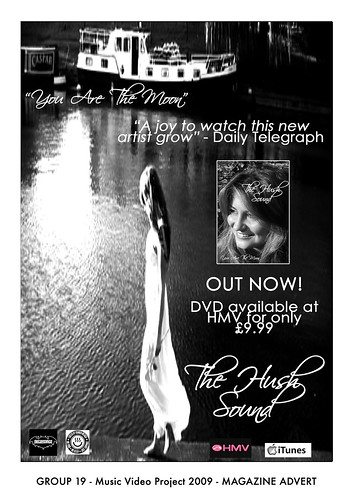
This music magazine advert has the conventions it needs as well as extras:
- Picture of the artist
- The release date
- Where it's available to purchase from
- The DVD name
- The song name
- Store logo's that the song is available from
- Reviews from well known critics
When looking at the photo the first thing I noticed was that the advert is in black and white (except the "HMV" logo). Next was the pool of light reflected in the water. Next, to the right of this is a girl in a white dress looking at the water. The white dress really works well with the black and white image as the shadows on the girls hair, arms and legs really make the white noticeable, plus the water to the right to her is very dark with shades of black and dark grey. The eye is then drawn to the box image of the artist who sung the song and under the "OUT NOW!" writing which is bigger than the other writing with an exclamation mark to make the viewer feel urgency to buy the DVD. Underneath this is where the DVD is available from and for how much, again under this is is the DVD/album name with the HMV and iTunes logo's to show where it's on sale.
Next the eye then looks around the image again to pick up any detail of the advert it may have missed. My eye was drawn to the white boat in the top left corner of the image as its on dark water with soft shadows all around it. Under the boat is the song name "You are the moon" which makes the viewer associate the pool of light under the name with a reflection from the moon. And under to the right is the critics review from The Daily Telegraph.
This advert tells the view a lot about the artist and what the songs on the album will be about. The black and white theme of the image makes me think of old black and white movies and romance. Other factors that make me think of this is that she is by the water, only being able to see by the moon light. Also her dress looks very thin and fly away and her hair being worn down and is going down her back. She doesn't look like she's about to go to a party and the soft shadows make the mood of the image very calm which means the music is very likely going to be about love and be very soft and possibly relaxing.
This advert tells the view a lot about the artist and what the songs on the album will be about. The black and white theme of the image makes me think of old black and white movies and romance. Other factors that make me think of this is that she is by the water, only being able to see by the moon light. Also her dress looks very thin and fly away and her hair being worn down and is going down her back. She doesn't look like she's about to go to a party and the soft shadows make the mood of the image very calm which means the music is very likely going to be about love and be very soft and possibly relaxing.
Thursday 17 November 2011
Ideas for digipak


Image of her crying (tears) to represent a bad day on the front cover.


Ripples for the inside cover, behind the disk. (from the tears).

example of a text message, this will be on emmas phone displaying the special features of the digipak. we will put this on the back cover.

Example of a colorful umbrella to bring the tone up.

Example of a colorful umbrella to bring the tone up.

Thursday 3 November 2011
Our ways of responding to the rough cut feedback
Good-win
We had a series of strong close ups that we got told were used effectively to show and advertise our artist but after viewing our video again we noticed one shot at 1.27 showed a falter in the close up and so we have decided in relation to the feedback to go out and re-film this part of the song maybe using the tripod to avoid the shakiness we has last time.
Editing
Part of our feedback was we needed to use more transitions in our video to create a bit of a variety between our different shots. We decided this was a good way to add a change of pace to some areas of the video whilst also causing the video to flow more. We decided at the end of the video to have a fade out on the last shot of me this was because when the song ends rather than end abruptly it fades out like many pop songs do we decided a fade here would comply nicely with the characteristics of the genre.
Camera Work
We were told by our fellow students that although our video started out strong with a variety of differents shots towards the end we lost it, as a group we decided the best way to solve this was to go out and re film some shots and add in more performance shots. Before doing this we were also told by Amar and Andrea that some of our close up shots were too close and Amar commented and told us these tended to make me look very self consious and uneasy which made watching it uncomfortable for our audience, he also told us he believed our performance shots looked the most confident and that we should film more and add them in on the chrous to fit the beat and make the video fit the up beat tempo. To sort out a use of more camera angles we decided to film certain shots over again but from different camera angles.
Mise - en - scene
We were pleased to know that although we had several costume changes that they fitted in well with the genre and the video we have created. We did find though that by adding more shots we added in a further 2 costume changes our video now has a whooping 5-6 costume changes and enough checker shirts to stock a clothes shop but this was good apparently as it created the effective use of a time scale. one bit of feedback we did not agree with was the difficulty to see the rain in the first shot we all agreed as a group and with our teacher that this was not correct and that the rain was easily visable and although we thought this was an effective shot we had to take it out as I was singing through my hair and it caused an self consious appearance. The other piece of feedback that we did not 100% agree with was that the beginning shot of me in bed was too dark, after Andrea and Amar watched it they both agreed it was a good, exciting shot the way it was and we explained that when it comes to evaluating our video we will mention that it was meant to be morning so it was suppose to be dark.
Performance
For this section we took all our feedback from Amar and Andrea who told us to enhance our performance shots as these tended to be the strongest and most watchable shots in the video. De to this we decided to delete a lot of our video which showed me too close up or self consious and we went out and refilmed more shots of me exerting "ATTITUDE!!". We also added in a few shots of me dancing as we found this created an fatser pace and thus added a extra up beat lift to the song. W also replaced the shots of me looking self consious and replaced them with ones of me so I was looking directly at the camera but so irt wasn't directly looking at me.
Tuesday 1 November 2011
rough cut feed back
1) Goodwin.
- The lyrics matched the visuals.
- Showing the artist a lot to help with advertising.
- Effective use of reverse shot.
- Good variety of cuts which gave the video pace.
- Does however need more transitions.
- Variety of shots at beginning- towards the end you might need more.
- Good use of zoom- possibly used too much and too close into the face.
- Camera use fairly steady- more shots to break it up- different angles?
- Good use of costume change.
- Too dark at the beginning.
- Lots of costume changes- represents time scale.
- Good use of props.
- Good locations to emphasize themes of song. Can't really see it's raining though.
- Use some stronger shots to enhance the performance as there are some really good shots but others which show the singer being self concious let down the performance.
- Need to have more shots looking directly at camera instead of looking at some one that the audience can't see.
Friday 28 October 2011
Magazine advert analysis.
 This is a magazine advert for Ellie Goulding's album Lights.
 The focus of the magazine advert is on the artist who takes up most of the frame for the advert. In parts of her hair there are strands of light and the writing of the artists name and the album name are in a bright yellow/gold colour which all contribute to the ablum name of 'lights'.
The lighting used on the artist's face is soft creating soft shadows to make her features look soft. Her singing voice is quite soft so the lighting used might be representing this.
Her blonde hair also fits in with the colours used to represent the light used.
The magazine advert also has 4 different ratings from different companies, 2 of them are from the independant and the times.
Subscribe to:
Posts (Atom)