U1-47
pros
costumes work well with genre.
lyrics match visuals well such as when he counts on his fingers
shot variation fits with fast pace
lip syncing effective
change of artist in song fits with change they did with people
good use of locations
cons
ends a bit suddenly if this was deliberate sorry its not really a criticism just something a bit random don't know if it works
Wednesday 30 November 2011
Final Video feedback
U1-46
pros
good use of locations
good dance routine fits in with genre
shot variation good
good use of spiltscreen
close ups used good
cons
some of the locations a bit plain
spiltscreen good but didn't fit with beat of the song
could of used a few more close ups
pros
good use of locations
good dance routine fits in with genre
shot variation good
good use of spiltscreen
close ups used good
cons
some of the locations a bit plain
spiltscreen good but didn't fit with beat of the song
could of used a few more close ups
Final Video feedback
U1-43
The skipping and the peeking out from behind the bush at the beginning give the video a fun element. The locations create a nice motif as they are used throughout. Use of movement by artist fits well with pace of song and the lip syncing is used in effective places. The way sophie disappears into the leaves at the end is sort of like leaving wonderland so gives the video an example of where the lyrics match the visuals.
Cons
very beginning the lip syncing doesn't look totally in sync. two scenes where sophie is rolling in leaves camera a bit wobbly
Final Video feedback
U1-48 final video
Likes
I love the use of the graffiti at the beginning of the song as I believe it fits in well with the songs genre.The skateboarding scene is good as it acts as a break between the singing so helps keep audiences attention. the black and white effect is really effective as it fits in time with the musics beat and the editing and camera angle variations are good.
Cons
too little lip syncing.
some of the shots were not very clear.
Directors Commentary
What is a directors commentary?
- A directors commentary is a discussion about an event or a piece of production work such as a music videos, films or documentaries.
- additional audio track
- consists of a lecture or comments by one or more speakers
- plays in real time with video
- they can be entertaining or serious
- can add information for audience members that might not otherwise be disclosed to them
- theres are many different types of commentary. they are...
- partial or scene specific - only covers specific scenes in the production. sometimes they are filmed without the speaker watching the video and this may mean the speaker uses more general comments than specific details.
- feature length or scene specific - recorded in one session. speaker watches the video from beginning to end and gives thoughts on what is happening on screen at the time.
What is a directors commentary?
There are several different types of commentary. The two main types simply define the length of the commentary rather than the type of content. They are:
- Partial or scene-specific, which only covers selected scenes of the film. Sometimes these are recorded without the speaker viewing the film and thus the commentator may make more general comments than pointing out specific details.
- Feature-length or screen-specific, which is recorded in one session: the speakers watch the movie from beginning to end and give their thoughts directly based on what is happening on-screen.
Tuesday 29 November 2011


Feedback
U1 44
Pros -
Good use of Visuals and lyrics
Good use of effects
The splitscreen is effective in the last few sections
Cons -
Bad use of locations
Shots need to be more varied
Face paced song, needs more shots
Some pieces are unclear (Matt walking into Emma, Mellisa smoking - I obviously knew but your audience won't)
luka, josh, shona
Thursday 24 November 2011
Location reccie for digipak (photo 4)

This photo shows the full potential of the leaf piles that are available and there are also a lot of trees to be used. Next lesson we will take photos from the best two locations that we have found and then edit both and submit the one that works best for our album.
Location reccie for digipak (photo 3)

This is our third possible location idea for the photo shot for our digipack. For this shot we have tried to incorporate both the woodland and the field to merge he 2 ideas and give us a wider variety of possible shots and positions that emma can be in. As well as having shots of her in different poses at different positions on the field, we can also have her in the woodland setting, hiding behind trees and such.
Location reccie for digipak (photo 2)

After looking around for another possible location we came across the woods where we filmed part of our music video. Our idea is the same except possibly using trees for Emma to climb, if she can't climb them then find a smaller tree. She could also hide behind one of the trees as it will bring an element of playfulness into the album. This photo doesn't show the full potential of the leaf pile and the different heights of the trees which we could use. We then took another photo at a different angle.
Location reccie for digipak (photo 1)

We took this photo as our first idea as the album cover and have Emma standing at different points of this photo holding different coloured umbrellas and in different poses. After looking at other locations for this idea we found that a field is quite boring as an album cover as we could use the woods and use the leaf piles and trees as props.
Drawn idea for album cover

This is our basic idea for our album cover. We will take various photos of Emma standing in different places in the field or woods and put the photos on top of each other to make it seem as if she is in a lot of places at once.
As you can see in the top right corner, we will have an image of a phone on the rear cover displaying the special features of the digipack. This idea was taken from the shot of the phone in our music video, the same phone will be used in the same way to display the connection with our video.
On the front cover we will have a promotional sticker, possibly displaying a quote about the quality of the album and illustrating why the audience should purchase the album.
We will also have a track listing on the rear cover to display which tracks are included in the digipack as well as the artist and album name on the front cover.
Tuesday 22 November 2011
An example of a real digipak
![[PROG TRIP] Digipak](http://farm3.staticflickr.com/2754/4353567916_15c58364e6.jpg)
This digipak for a CD cover has similar pictures to show the viewer that these 2 products are a set. It is shown through the animated face in the middle of both products but they are different from each other. This is to distinguish between the different types of the same products.
Digipaks ussually include:
Album CD front cover:
- Lyrics on an album
- Photos of the artist (possibly signed)
- Mention of bonus (tracks, video, karaoke, slide show)
- The Album name
- Bar code
- Album art
- Artist name
- A simple colour scheme that is consistent throughout the digipak
- Different colour for the font that will stand out
- Font that is bold and simple so it's easy for the viewer to read. Also have different or similar font for the album name and artist name
Album CD back cover:
Analysing a real magazine advert

This magazine advert promoting the album for Plan B has the conventions that it needs such as:
- The artist name
- A picture of the artist
- The album name
- Critic reviews
What it doesn't have is where the album is available from, when it's available to buy or the price.
The first thing that is noticed in this image is the "Plan B" written in red right at the top of the page, then the artist's picture as its associated with the name. The next thing is the white writing under the "Plan B" The writing slowly gets smaller down the page until the critics are the smallest and harder to read except for the 5 stars.
The artist in the image is in the right side looking towards the left with a microphone that is associated with the old style of music. This works well as the music that Plan B makes is in the style of old music with live music such as strings, brass, electric guitars and bass guitars.
At the bottom of the page is a picture of the album cover for viewers to be able to find the album easily.
Concepts Conversation
We have decided to adjust our concept for our magazine advert and digipack because although our ideas were well suited to the song the were not so well suited to the artist.
Rather than just using the idea of tears for each we have decided that the repeating theme for them will be umbrellas. The reason for this is that we feel one of the more prominent shots of our music video is the shot of emma throwing her umbrella to the ground. We will use a screenshot of the shot on our magazine advert and will continue the theme by using images from a photo shoot of emma with various umbrellas in various moods.
We will gather images of emma looking glamourous and happy with more colour to indicate the happier side and show the usual themes used by the saturdays for there album covers and magazine ads.
Friday 18 November 2011
Our music video storyboard

Because our shot lit consisted of 24 shots all of which were quite similar I decided to take the most important shots and write them up into the storyboard this is the reason why this storyboard only consists of 7 shots as we agreed as a group these were the 7 most important action shots.
We also found when filming we had to change our location and a few of our shots so our shot-list and storyboard differ very much from our final music video.

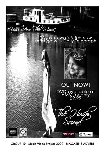
This music magazine advert has the conventions it needs as well as extras:
- Picture of the artist
- The release date
- Where it's available to purchase from
- The DVD name
- The song name
- Store logo's that the song is available from
- Reviews from well known critics
When looking at the photo the first thing I noticed was that the advert is in black and white (except the "HMV" logo). Next was the pool of light reflected in the water. Next, to the right of this is a girl in a white dress looking at the water. The white dress really works well with the black and white image as the shadows on the girls hair, arms and legs really make the white noticeable, plus the water to the right to her is very dark with shades of black and dark grey. The eye is then drawn to the box image of the artist who sung the song and under the "OUT NOW!" writing which is bigger than the other writing with an exclamation mark to make the viewer feel urgency to buy the DVD. Underneath this is where the DVD is available from and for how much, again under this is is the DVD/album name with the HMV and iTunes logo's to show where it's on sale.
Next the eye then looks around the image again to pick up any detail of the advert it may have missed. My eye was drawn to the white boat in the top left corner of the image as its on dark water with soft shadows all around it. Under the boat is the song name "You are the moon" which makes the viewer associate the pool of light under the name with a reflection from the moon. And under to the right is the critics review from The Daily Telegraph.
This advert tells the view a lot about the artist and what the songs on the album will be about. The black and white theme of the image makes me think of old black and white movies and romance. Other factors that make me think of this is that she is by the water, only being able to see by the moon light. Also her dress looks very thin and fly away and her hair being worn down and is going down her back. She doesn't look like she's about to go to a party and the soft shadows make the mood of the image very calm which means the music is very likely going to be about love and be very soft and possibly relaxing.
This advert tells the view a lot about the artist and what the songs on the album will be about. The black and white theme of the image makes me think of old black and white movies and romance. Other factors that make me think of this is that she is by the water, only being able to see by the moon light. Also her dress looks very thin and fly away and her hair being worn down and is going down her back. She doesn't look like she's about to go to a party and the soft shadows make the mood of the image very calm which means the music is very likely going to be about love and be very soft and possibly relaxing.
Thursday 17 November 2011
Ideas for digipak


Image of her crying (tears) to represent a bad day on the front cover.


Ripples for the inside cover, behind the disk. (from the tears).

example of a text message, this will be on emmas phone displaying the special features of the digipak. we will put this on the back cover.

Example of a colorful umbrella to bring the tone up.

Example of a colorful umbrella to bring the tone up.

Thursday 3 November 2011
Our ways of responding to the rough cut feedback
Good-win
We had a series of strong close ups that we got told were used effectively to show and advertise our artist but after viewing our video again we noticed one shot at 1.27 showed a falter in the close up and so we have decided in relation to the feedback to go out and re-film this part of the song maybe using the tripod to avoid the shakiness we has last time.
Editing
Part of our feedback was we needed to use more transitions in our video to create a bit of a variety between our different shots. We decided this was a good way to add a change of pace to some areas of the video whilst also causing the video to flow more. We decided at the end of the video to have a fade out on the last shot of me this was because when the song ends rather than end abruptly it fades out like many pop songs do we decided a fade here would comply nicely with the characteristics of the genre.
Camera Work
We were told by our fellow students that although our video started out strong with a variety of differents shots towards the end we lost it, as a group we decided the best way to solve this was to go out and re film some shots and add in more performance shots. Before doing this we were also told by Amar and Andrea that some of our close up shots were too close and Amar commented and told us these tended to make me look very self consious and uneasy which made watching it uncomfortable for our audience, he also told us he believed our performance shots looked the most confident and that we should film more and add them in on the chrous to fit the beat and make the video fit the up beat tempo. To sort out a use of more camera angles we decided to film certain shots over again but from different camera angles.
Mise - en - scene
We were pleased to know that although we had several costume changes that they fitted in well with the genre and the video we have created. We did find though that by adding more shots we added in a further 2 costume changes our video now has a whooping 5-6 costume changes and enough checker shirts to stock a clothes shop but this was good apparently as it created the effective use of a time scale. one bit of feedback we did not agree with was the difficulty to see the rain in the first shot we all agreed as a group and with our teacher that this was not correct and that the rain was easily visable and although we thought this was an effective shot we had to take it out as I was singing through my hair and it caused an self consious appearance. The other piece of feedback that we did not 100% agree with was that the beginning shot of me in bed was too dark, after Andrea and Amar watched it they both agreed it was a good, exciting shot the way it was and we explained that when it comes to evaluating our video we will mention that it was meant to be morning so it was suppose to be dark.
Performance
For this section we took all our feedback from Amar and Andrea who told us to enhance our performance shots as these tended to be the strongest and most watchable shots in the video. De to this we decided to delete a lot of our video which showed me too close up or self consious and we went out and refilmed more shots of me exerting "ATTITUDE!!". We also added in a few shots of me dancing as we found this created an fatser pace and thus added a extra up beat lift to the song. W also replaced the shots of me looking self consious and replaced them with ones of me so I was looking directly at the camera but so irt wasn't directly looking at me.
Tuesday 1 November 2011
rough cut feed back
1) Goodwin.
- The lyrics matched the visuals.
- Showing the artist a lot to help with advertising.
- Effective use of reverse shot.
- Good variety of cuts which gave the video pace.
- Does however need more transitions.
- Variety of shots at beginning- towards the end you might need more.
- Good use of zoom- possibly used too much and too close into the face.
- Camera use fairly steady- more shots to break it up- different angles?
- Good use of costume change.
- Too dark at the beginning.
- Lots of costume changes- represents time scale.
- Good use of props.
- Good locations to emphasize themes of song. Can't really see it's raining though.
- Use some stronger shots to enhance the performance as there are some really good shots but others which show the singer being self concious let down the performance.
- Need to have more shots looking directly at camera instead of looking at some one that the audience can't see.
Subscribe to:
Posts (Atom)